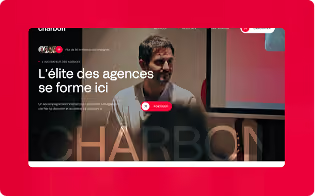


This article published by Agence Norry analyzes the emergence of tactile brutalism in web design as a reaction to the homogenization of AI-generated websites. It explains why so many sites look alike today, what tactile brutalism actually means (raw geometry, aggressive contrasts, simulated physical textures, kinetic typography), which brands are adopting it, and how Norry supports companies that want an authentic visual signature.
AI has created a web of copies
AI-generated content and design solved a real problem: it made digital creation accessible to thousands of companies that had neither the budget nor the resources for an agency. The result is a genuine democratization of baseline quality.
But it also created a large-scale side effect: when everyone uses the same tools, the same templates, the same automatically generated interfaces, the visual baseline becomes normalized. We end up with a web where the difference between a fintech, an HR agency and a consulting firm comes down to the accent color of the CTA button.
This phenomenon has a name in design circles: homogeneous Soft UI. Soft drop shadows, 8px rounded corners, pastel colors, floating components. It's the default visual language of AI builders, generated Figma templates and generic design systems. It's functional. It's harmless. Above all, it's perfectly invisible.
For high-end brands, this is an existential problem. When your site looks like your competitors', your design no longer works for you. It works for the category.
Tactile brutalism: the response of brands that refuse to blend in
Faced with this uniformity, a counter-trend has taken hold among agencies and international premium brands: tactile brutalism.
The term combines two ideas. Brutalism, borrowed from the architecture of the 1950s-70s, which values the raw exposure of materials and structures rather than hiding them behind smooth finishes. And tactile, which evokes texture, material, physical presence - precisely what Soft UI sought to eliminate.
The goal is explicit: to prove a human signature. To create a visual artifact that an automatic generation tool wouldn't have produced. And, in doing so, to immediately stand out from the crowd.
What this means in practice
Tactile brutalism isn't a uniform aesthetic, but a set of shared choices that oppose the conventions of Soft UI point by point.
- Raw geometry rather than softened shapes. Where Soft UI rounds everything off, tactile brutalism uses 0px corners, square containers, and visible, unapologetic grids. The structure is there, exposed, proudly displayed.
- 1px borders rather than drop shadows. Depth is no longer simulated with blur. Containers are delimited by solid 1px borders, often in neon or pure white on a dark background.
- Aggressive contrasts rather than soft palettes. Deep black or charcoal interrupted by a single acid color - cyan, magenta, chartreuse. No subtle gradients.
- Simulated physical textures. CSS grain, SVG noise overlays, film grain effects. A solid background with a subtle grain immediately looks like printed paper or an industrial surface. Three lines of CSS, zero performance impact.
- Kinetic typography as the main architecture. A single ultra-wide word that spans the full width of the screen. Headings whose weight and width evolve on scroll. Contrasting font pairings: an elegant neo-serif for headings, a utilitarian monospace for metadata and buttons.
Why now?
Brutalism isn't a new trend in web design. What's new in 2026 is the context that has made it urgent for mainstream brands. Three factors have come together.
- Soft UI saturation. AI builders democratized good generic design so quickly that visual competition has shifted. Having a nice, clean site is no longer enough. It's the minimum expected, not a differentiator.
- Aesthetics become proof of intent. In a context where any tool can generate a page in seconds, a design that manifestly requires human work, opinion and risky choices sends a strong signal.
- Technical performance is no longer sacrificed. CSS textures and SVG grain cost virtually nothing in page weight. Kinetic typography eliminates heavy images. It's a visually aggressive design that can still achieve an excellent Lighthouse score.
Who is adopting it, and for what kind of brand
Tactile brutalism isn't for everyone, and that's precisely what makes it effective. Sites like reaal.studio embody this style: visible grids, massive block fonts, deliberate asymmetry. The ice cream makers Laoka show how brutalism works even for food brands.
The general rule: tactile brutalism suits brands that have an opinion and are willing to polarize. Creative agencies, design studios, luxury brands with a strong positioning, tech startups that want to signal a break with the past, cultural labels.
It is poorly suited to traditional banks, public institutions or general health sites. The raw aesthetic can be perceived as anxiety-inducing in those contexts.
An emerging variant softens the formula: cute-alism, which blends brutal structural rigor with kawaii illustrations and candy colors, targeting in particular brands that want to stand out on social media without going to the full intensity of pure brutalism.
The Bento Grid paradox
Beyond tactile brutalism, the Bento Grid deserves some nuance. This modular block layout is massively promoted by builders and templates, but on mobile, multi-column grids collapse. Mediocre implementations duplicate the DOM, doubling page weight.
Properly executed with native CSS Grid and a state-aware architecture, the Bento Grid delivers maximum information density with no mobile penalty. A +38% CTR has been documented on well-built implementations. Poorly executed, it's one of the most common traps in web design in 2026.
What Norry does with all this
At Norry, we work on Webflow and build digital identities for companies that don't want to look like their competitors. Tactile brutalism is an approach we master and deploy when the brand's positioning justifies it.
What we consistently observe: brands that have invested in an authentic, differentiating design generate more engagement, more recall, and better-quality prospects. A site that surprises is a site people remember.
Where to start: the first choices that change everything
- Choose an ultra-wide system font. Times New Roman or Arial at 80-120px as a hero element. It costs nothing and instantly changes a page's visual personality.
- Limit yourself to two high-contrast colors. A black or charcoal background + one acid color. Restriction creates visual tension.
- Make your borders visible. Replace drop shadows with solid 1px borders.
- Add grain. A CSS grain filter on a solid background. Three lines of CSS, zero performance impact.
- Make your grids visible. Expose the structure rather than hiding it under floating elements.