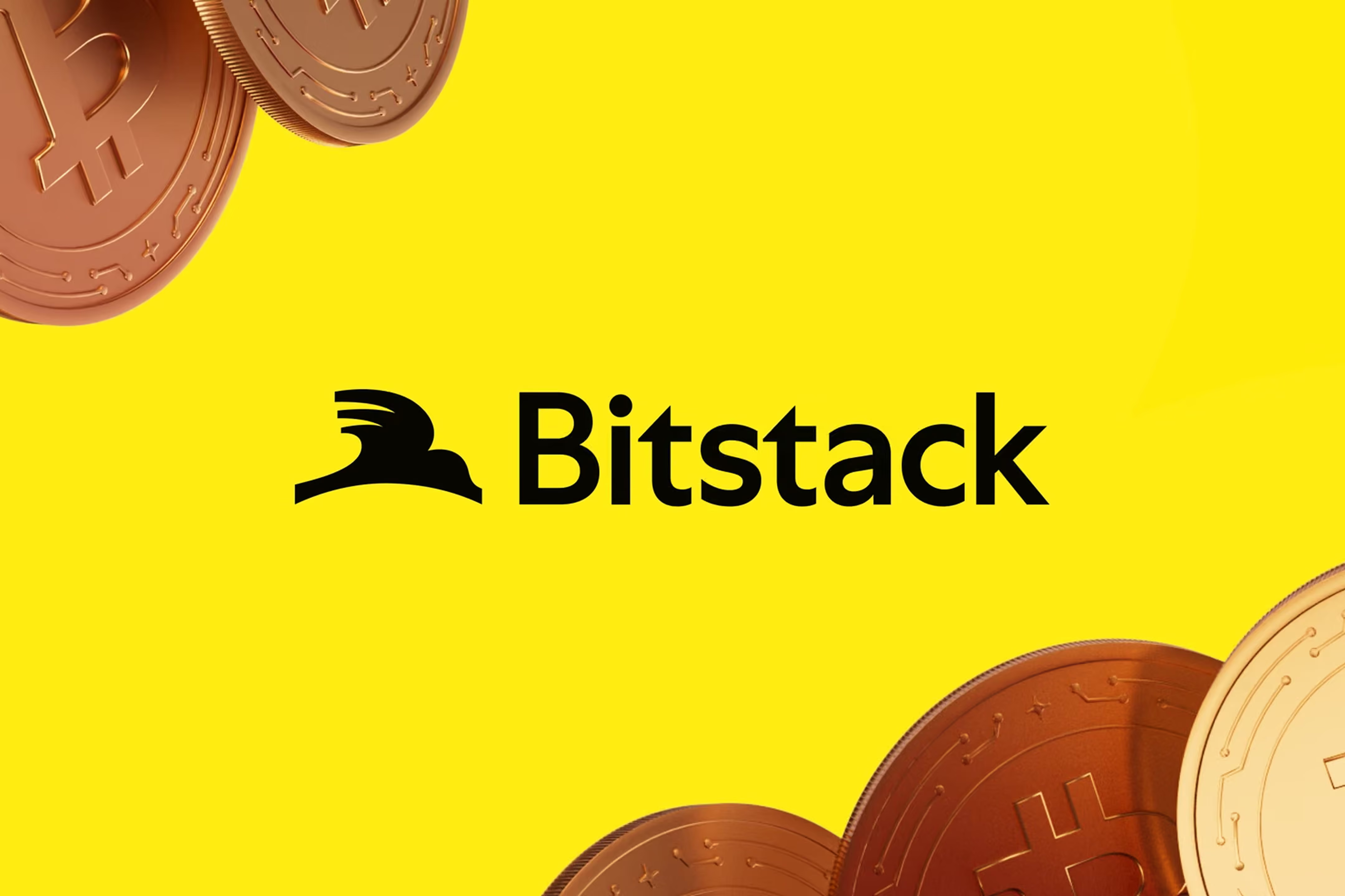

On October 28, 2026, Bitstack unveiled its new identity, designed with the agency Anagram. Everyone will talk about the bird. For me, it was a different line in the launch post that stopped me: the product had outgrown the brand. That's what I call brand debt, and I see it at companies far smaller than Bitstack.
What Bitstack really announced
Bitstack was born in 2021 from a deliberately simple idea: make bitcoin savings accessible to everyone. First with automatic round-ups on everyday spending, then recurring purchases and savings goals.
Today, the app is no longer just that. It is organized around three pillars:
- Save. Build your bitcoin savings over time, automatically or at your own pace.
- Spend. Manage your euros and pay with the Bitstack card, so everyday life becomes an opportunity to save.
- Grow. Put money you've already saved to work, with simple products.
The new identity follows this evolution. Its symbol combines three ideas: the letter B, a bird in motion and a curve that traces a horizon. The tagline fits in three words: Own Your Future.
| Bitstack in 2021 | Bitstack in 2026 | |
|---|---|---|
| Promise | Make bitcoin savings accessible to everyone | Save, spend and grow your money |
| Product | A bitcoin savings app | A platform with savings, the Bitstack card and a euro account |
| Mechanics | Automatic round-ups, then recurring purchases | Round-ups, recurring purchases, goals, card, products to grow your money |
| Ambition | Democratize bitcoin savings | Apply that simplicity to a growing share of users' financial lives |
Brand debt: a concept I see everywhere
In development, we talk about technical debt: every shortcut taken to move faster creates a future cost. Brand debt works the same way. Every time the product evolves without the identity keeping up, the gap accumulates.
Nothing breaks. The company keeps running. But every prospect pays interest: you have to explain what you really do, make up for the old image, correct expectations. The cost is invisible until you measure it.
Bitstack states it very clearly in its post: its former identity reflected the early Bitstack, not the product it has become. It's rare to see a brand lay out the diagnosis this plainly, and that's what makes this rebrand credible.
The milestones that widened the gap
This rebrand doesn't come out of nowhere. In less than two years, Bitstack has made a series of changes that each widened the company's scope.
| Date | Event | Source |
|---|---|---|
| April 2021 | Bitstack founded, a bitcoin savings app | Bitstack press releases |
| Dec. 12, 2024 | €5 million raise, new app version and new brand identity | Bitstack press release |
| June 30, 2025 | MiCA license obtained, goal of European expansion | Bitstack press release |
| Dec. 2, 2025 | $15 million raise to become the European leader in bitcoin savings | Bitstack press release |
| June 10, 2026 | Equity opened to the public, over 8,000 investors, a record in the European Union | Bitstack press release |
| Oct. 28, 2026 | New identity unveiled with the agency Anagram | Bitstack blog |
A license, two raises, an equity offering to the public, a card and a euro account. The product moves forward in steps. The brand tends to stay where it was left.
It's also worth noting that this isn't the first time Bitstack has touched its identity: the December 2024 raise already came with a new app version and a new identity. When a product changes scale, a single update isn't always enough. The brand has to keep up with every step.
What the brief reveals
Bitstack describes what it asked Anagram for, and it's an excellent lens for any rebrand:
- A simpler, more mature and more distinctive brand.
- An identity that inspires trust while remaining accessible.
- A brand that talks less about the technology and more about what it should enable people to achieve.
- A system that lives equally well in the app, on a card, on the web and in the street, as well as through European expansion.
The third point is the most interesting. Moving from a technology message to a benefit message is the same move Mirinda made, putting flavor back at the center rather than the logo. In finance, and even more so in crypto, this shift is a bold choice: you reassure through the outcome, not through the technology.
Why a bird
Bitstack's symbol stacks three readings. The letter B, which anchors the brand. The silhouette of a bird in motion, which speaks of freedom and momentum. And a curve at the base that draws a horizon, a sign of long-term thinking and conviction in bitcoin.
What I take away is the choice of a symbol that tells a trajectory rather than a return. For a brand that handles people's money, talking about direction rather than performance is a stance, and it is consistent with the promise: moving forward steadily, without having to question every decision.
What doesn't change
Bitstack devotes an entire section of its post to what stays stable, and that's an excellent reflex. A rebrand, especially in finance, must first say what isn't moving.
- Bitcoin remains at the heart of the product.
- Simplicity remains the design principle.
- Security and trust remain fundamental requirements.
- The mission remains the same: enabling everyone to build and protect their financial future.
In the app update announcement, Bitstack even reassures its users on the essentials: their bitcoins are exactly where they left them.
Four lessons, whatever your size
- Measure your brand debt. List what you sell today and compare it with what your website and identity say. The gap is your debt.
- Clarify the offer before redrawing the logo. At Bitstack, the three pillars existed in the product before they existed in the brand. The rebrand gives shape to an already clear structure; it doesn't replace it.
- Start by saying what doesn't change. Existing customers read a rebrand as a risk. Reassure them first.
- Think of the brand as a system. An identity has to hold up in an app, on a card, on a website and in the street. A logo alone is no longer enough.
The question to ask yourself
If you had to describe what you sell today in three pillars, would your website talk about it in the same terms? If the answer is no, or if you hesitate, you probably have brand debt. It doesn't show in your numbers, but it's paid at every first meeting.
This article by Mélina Ramos, co-founder of Agence Norry, analyzes the Bitstack rebrand unveiled on October 28, 2026 with the agency Anagram. It introduces the concept of brand debt, the gap that widens when a product grows faster than its identity, and draws lessons for any company whose offer has evolved.