
This article by Mélina Ramos, co-founder of Agence Norry, analyzes the Mirinda rebrand launched by PepsiCo on April 28, 2026. It unpacks the strategic decision to move from a brand-driven identity to a flavor-driven one, and draws lessons any business can apply to its own brand strategy.
What PepsiCo really changed
Mirinda has existed since 1959. For sixty years, the brand worked like many global soda brands: a central logo, a recognizable color palette, a brand architecture that takes precedence over the product itself. The flavor was on the packaging, but as secondary information. What you saw first was Mirinda.
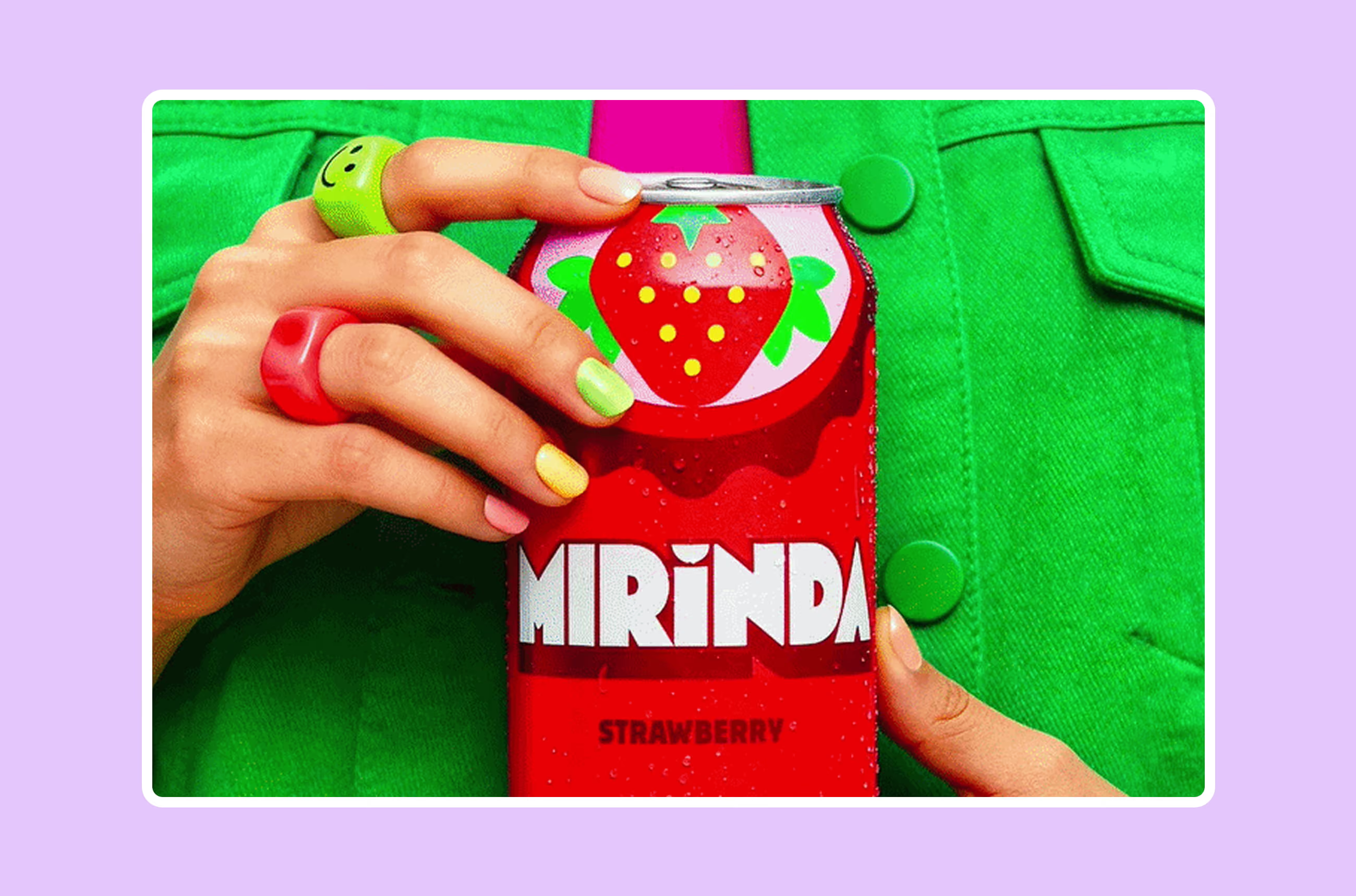
The 2026 overhaul completely reverses this logic. PepsiCo calls it the shift from a brand-led identity to a system of expression. What that means in practice: the flavor becomes the most immediate and most distinctive visual signal. An oversized orange, built from simple half-circle shapes, now takes up most of the packaging. The fruit is recognizable before the eye has even read the brand name.
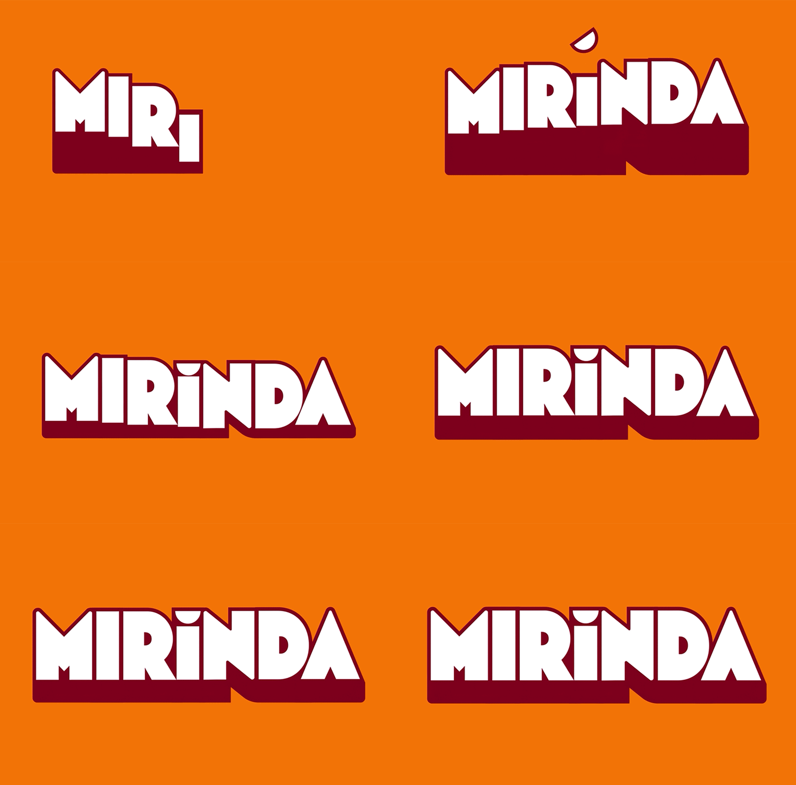
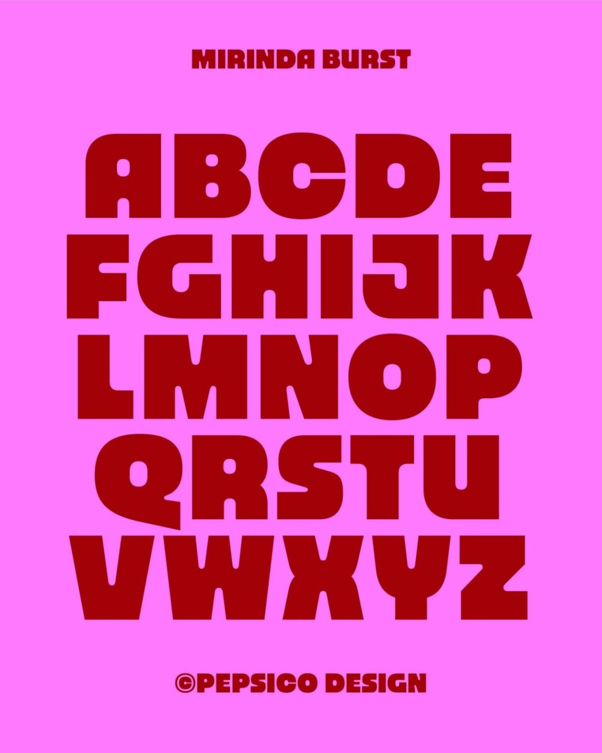
The custom typeface Mirinda Burst, created in collaboration with Naipe Foundry, follows the same logic: it isn't there to be elegant or neutral, it's there to embody the fruit's energy, its fizz, its physical presence. The typography doesn't illustrate the flavor. It is the flavor.
The identity system covers more than 50 flavors and 200 markets. PepsiCo had to design a flexible system that works in radically different cultural and linguistic contexts. The solution is elegant: the fruit half-circles work visually regardless of language.
Why this change now
This rebrand didn't happen by chance in 2026. It responds to a well-identified market pressure.
The fruit-flavored soda category has been under growing pressure for several years. Gen Z buys fewer sodas than previous generations, but when they do buy, they choose for different reasons. Traditional brand architecture, with its dominant logo and category colors, speaks little to consumers who want authenticity, texture, sensation.
PepsiCo put it directly in its launch communication: for decades, soda brands have put their brand architecture, colors and logos front and center. The real reason someone picks an orange over a grape, the identity of the flavor, has been quietly deprioritized. The new system corrects that.
It's a public admission that the category's historical logic was wrong. And that's precisely why this rebrand deserves study. It isn't PepsiCo changing its look. It's PepsiCo admitting that the way it spoke to its customers was centered on itself rather than on them.
The signal I take away
What strikes me about this rebrand is that it illustrates a tension I see very often at the companies I work with: the brand identity is built around what the company wants to say about itself, not around what the customer is really looking for.
At Mirinda, the logo was strong. The brand was consistent. But the main reason a consumer reaches for an orange can rather than a grape can, the flavor, was relegated to the background. The identity served the brand, not the purchase decision.
It's a pattern I regularly find on the websites of companies far smaller than PepsiCo. Home pages that talk about values and vision before talking about what the customer will get. Service pages built around internal organization rather than around the customer's problem. About pages that tell the founding story without ever answering the real question: why you rather than someone else.
Mirinda took sixty years to make this detour. The good news is that an SMB can fix it much faster.
What this rebrand says about nostalgia as a strategic tool
A second element deserves a note. To build its new identity, PepsiCo went back to Mirinda's origins in 1959. The design team revisited the visual codes of the 60s, 70s, 80s and 90s to recover a playful, expressive spirit the brand had lost while trying to modernize.
It's a counter-intuitive but consistent choice. Nostalgia isn't backward compatibility. It's an emotional shortcut to something already familiar and loved. And in a market where brands look more and more alike, notably because of the homogenization of design tools, anchoring in an authentic heritage is real differentiation.
It's reminiscent of what we're seeing in web design in 2026 with the emergence of tactile brutalism: brands choosing raw shapes, textures and visible imperfections to signal that their identity is built by humans, not generated by an algorithm. Mirinda is after much the same thing by reactivating visual codes that were hand-drawn before the digital era.
The three lessons I draw from it
- Your identity should speak first about the problem you solve, not about who you are. Mirinda realized that people don't choose a soda for the brand but for the flavor. Do your customers choose your product or service for the reasons you think? And do your website and brand identity highlight those reasons, or yours?
- Consistency is a strength, but not if it freezes you in place. Mirinda had a consistent, recognized identity. That wasn't what it lacked. What it lacked was alignment between its identity and the real reason its customers buy. The internal consistency of an image is worth nothing if it's disconnected from the customer.
- Brand heritage is not a burden. It's a raw material. PepsiCo didn't wipe the slate clean. They went back to the sources to extract what was authentically Mirinda. If your company has a history, even a short one, there are distinctive elements to reactivate. Many successful rebrands don't move forward. They go back to the origins.
The question this rebrand asks of your brand
Mirinda was well positioned, well recognized, well deployed across 200 markets. And yet something in its identity wasn't serving the real reason people bought it.
The question I systematically ask the companies I work with is the same one PepsiCo finally asked itself: does your brand identity speak first about you, or first about the reason your customers choose you?
They're not the same answer. And the difference shows immediately on a website, in a logo, in a welcome message. When the identity speaks to the customer first, they don't have to make the effort of working out whether you're made for them. They know at a glance.